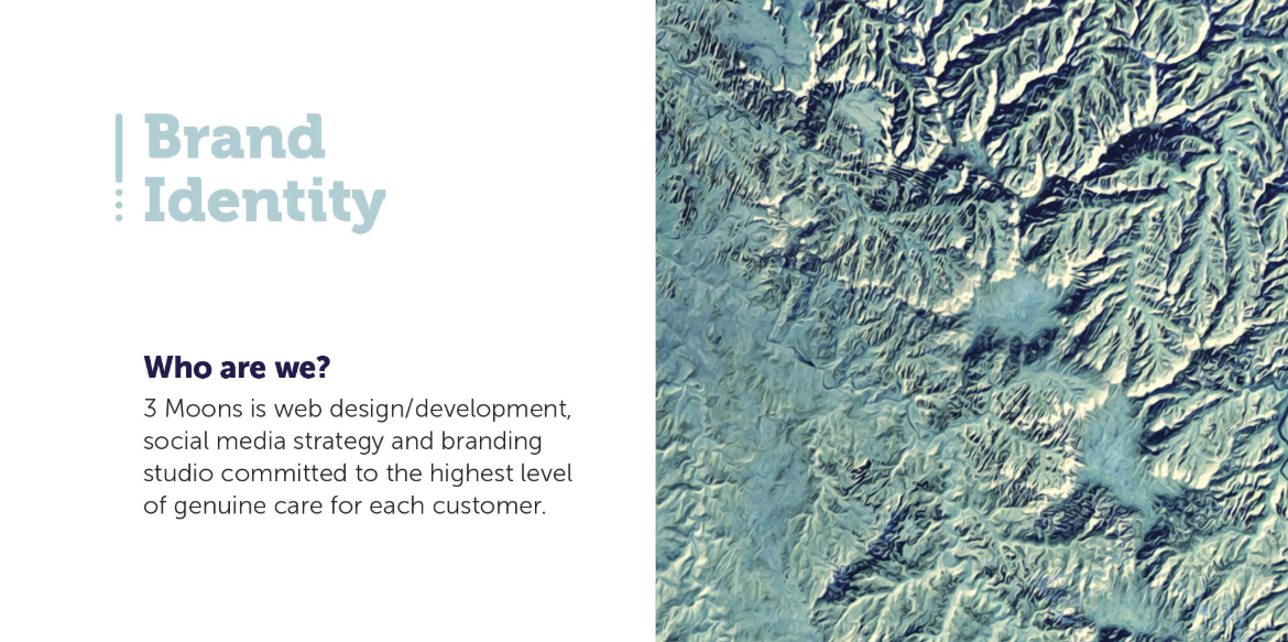
I recently did the first stylescape of my career for an identity project and it seemed to answer a lot of questions at the outset. This was for a company called 3 Moons Studio. Here’s what I learned.
First, what are they? Stylescapes -curated visual elements that display a unified style- are not meant to explore all styles but come to an agreement on a specific style. I’ve noticed a common thread among clients when facilitating an initial meeting:
design vocabulary isn’t universal and words and descriptions can have drastically different meanings.
A lot of clients just want to see examples -- “I don’t know what I want but I’ll know it when I see it”. This can be supremely inefficient for the working relationship. We now have a choice: design ten different styles of “professional” looking logos or compile styles for three unique stylescapes. Compiling is much more efficient than designing original concepts at this stage.
It's a lot of work on the front end but saves time and money overall, ensuring the designer and client are on the same page. Depending on the scale of the project, we use stylescapes to start off on the right foot with our client.
Unfortunately you can’t just jump in. The designer has to understand the needs of the company to form an idea of the look and feel. So a brand workshop to help to define the creative brief is in order.
Workshop
I kicked off with a brand workshop, spending 2+ hours with the owner, Gina. I listened to the company’s origin story, extracted her vision, values, and positioning goals. Though it seems like a long process and a lot of background information to wade through, it really helped develop an aesthetic for the stylescape.
The questions started off slow, but my confidence began to build as I probed into the passion of the business and where that passion comes from.
1. The Goal
Sometimes it’s easier to pull information from a client when it’s worded differently. Instead of “What’s the goal of 3 Moons?”, I tried “Imagine it’s 2030 and you’re looking back over the launch of your company. What is the most important thing you’ve achieved as a business?”
We defined the goal as:
Rebrand and reposition 3 Moons Studio from “web design and development” to “social media management, branding and web”.
As more things are unveiled, the goal can certainly change. It’s a great idea to start off with a defined goal as a baseline.
2. Value Proposition
By asking in-depth questions, I learned that the driving principle of 3 Moons was to
make it easy for small businesses and entrepreneurs to implement creative solutions that will make them better than before.
I unveiled this value statement by just asking the question, “Why is 3 Moons Studio in business”? If the first response is a non-starter like “to make money”, you can dig deeper and ask, “What are you trying to bring into the world, into the industry?”
3. USP
The unique selling point is always a hard one to tackle. It involves understanding if the market needs a differentiator. The refrain that kept coming back around is the
care this company has for small business.
The owner is a very genuine person and I can tell she wants to help small businesses as much as possible. It shows in her reviews and the quality of work.
4. Personality or Brand voice
This might be the hardest but most insightful. It is the soul of the business, and it’s similar to the unique selling point. It’s a way to be different than the competition. The personality descriptors we found were these:
Knowledgeable, trustworthy, accountable, creative, entrepreneurial, professional, generous, analytical, happy
The personality of the business -especially a small one- is often defined pretty closely to the owner. I wrote down every keyword Gina mentioned on a whiteboard, then we refined it.
5. Messaging
Taking a cue from the value proposition statement, we came up with:
We can help you be better than you’ve ever been. Eclipse your business’ past and excel in your industry.
6. Positioning Statement
In order to design the identity, create the stylescape, and identity the target audience, 3 Moons needed a positioning statement. This wasn’t a hard statement to find as it speaks to the unique selling proposition.
3 Moons is a content strategy/branding studio. Unlike other studios, we are small and entrepreneurial so we employ focused creative solutions that bring excelled growth to small businesses.
7. User Personas
I ask Gina to fill out 2 user profiles to inform the two stylescapes I would do. Here’s one of them:
Natalie: The Go-Getter
Natalie is 31, married, college-educated and an entrepreneur.
She’s a hard worker and has lots of things going on all at once.
She really loves nature and space.
She practices yoga and weight training, hiking and gardening and takes her dogs on walks.
She really needs help with business accounts.
She manages so many things and needs a creative solution to execute her ideas.
8. Creative Parameters
Lastly, I asked if she had any design sensibilities or creative parameters. She was pretty open with a few ideas of mid-century poster design, clean and professional look, and space-centered graphics.
Creative brief
By the end of this long discussion, we had our solid creative brief put together and were both pretty excited to get started on the stylescapes.
Pulling Images
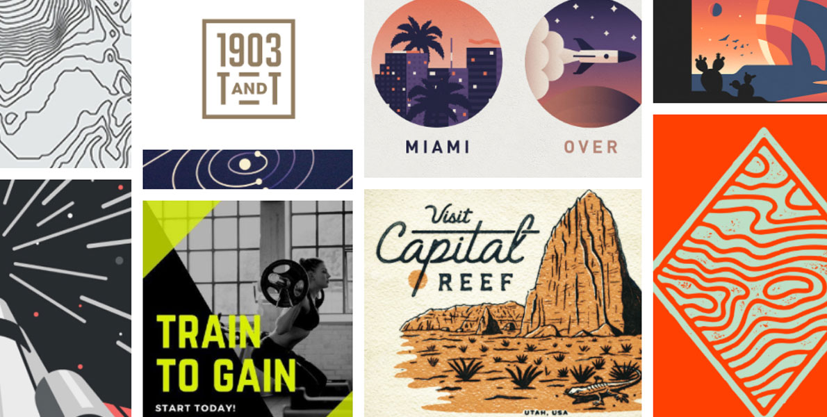
I did two compete stylescapes but here I will only focus on the winner. Zeroing in on Natalie as the hero of the stylescape, I created a mood of entrepreneurial spirit around her. Since mid-century posters was a preferred style, I searched for 1950’s travel posters and national park badges which proved to be a very interesting curation. I found this style to be enticing yet no-frills (think government agency design like road signs or airport wayfinding). Along with this poster design, I found minimal but bold fonts, utilitarian and strong earthy colors with a sense of adventure in the space designs. There’s almost a graphic novel look which fit in very well with graphic style I was envisioning. I used geometric san serif font choices and topographic textures fit very well in the adventure aesthetic (as seen in the brand guidelines below).
Post-Mortem
After the stylescape was completed, I submitted it to the client. Natalie the Go-Getter was a clear winner. From there, it was a pretty easy design period of sketching out three concepts and getting revisions. The color palette came quite naturally. As I reflect on the project, I really believe stylescaping saved lots of time and headaches. Had I not completed stylescapes, I think I would’ve had a month-long revision period, which would’ve cut into my profit.
–
Be prepared before seting up your stylescapes! Thanks to HolaBrief, you'll create a thorough creative brief that summerizes the business needs and end-user requirements. The perfect foundation to create unique stylescapes.