Rebranding is a long and challenging process and should be done for the right reasons. If your sales are dropping or you can't seem to reach the right people, rebranding is not the way to go. Reconsider solving these issues by creating new marketing strategies or diving deeper into user research.
So before you start the rebranding process, ask yourselves these questions:
Have our customers changed?
Do we want our customers to change?
How has our market changed?
Have we changed?
If the answer to these questions is a clear "Yes", then a rebrand might be the right decision.
But before you dive head first into the creative process of a rebrand, you have to redefine the company's vision, mission, values and market in a solid branding brief.
First strategy, then design!
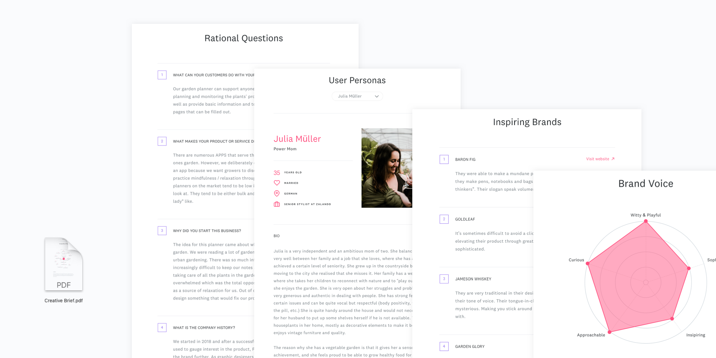
HolaBrief's Inspirational & Rational Questions template, User Persona template and Brand Voice – Inspiring Brands template can help set up a guided rebranding brief to figure out the core informations needed to start the rebranding.
Once you've defined your new strategy and set up a solid branding brief, it's time to consider how you want to rebrand the business. If a logo redesign is the outcome of your strategic analyses, we have some inspiring rebranding examples lined up. From Simplified typography to the use of Monograms or Gradients, we've broken down our favourite rebranding trends of 2018.
Simplified Typography
Sarah Hyndman says, “Fonts turn words into stories.”
Perhaps that’s the driving force behind a surprising trend of companies ditching half of the name or brand mark imagery altogether in favor of simple type treatment. These below made design news this year with this method.
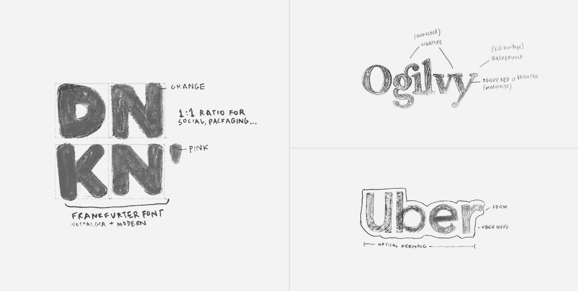
Dunkin’
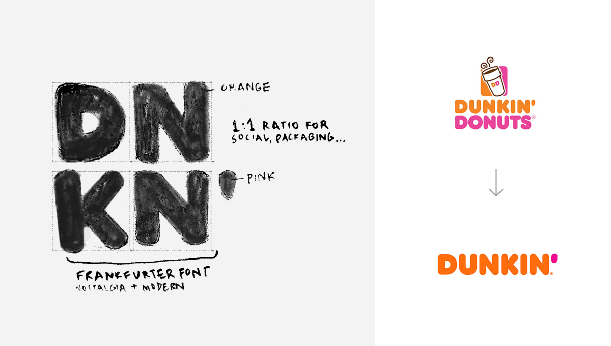
“Great coffee fast” is still the mantra over at Dunkin’. And to get that point across, Jones Knowles Ritchie Global (Budweiser, Kashi) partnered with Dunkin’ to drop the apparent unnecessary coffee icon and the end of their own legal name.
While this may seem like an odd and bold choice—literally scrapping the name of their known product—it’s actually the beginning of a new beverage-centric direction. Tony Weisman, CMO, sees “an opportunity to create an incredible energy” by modernizing the name.(1)
Now, Dunkin’ is on a first-name basis with the heartland of America and beyond. Dunkin’ can be successfully promoted on social media, even using the vowelless version (shown here). Dunkin’ simultaneously holds fast to nostalgia whilst pursuing the modernity of on-the-go coffee drinks. Whether this approach works or not, fast drinks are certainly the lifeblood of the contemporary mover and shaker.
Ogilvy
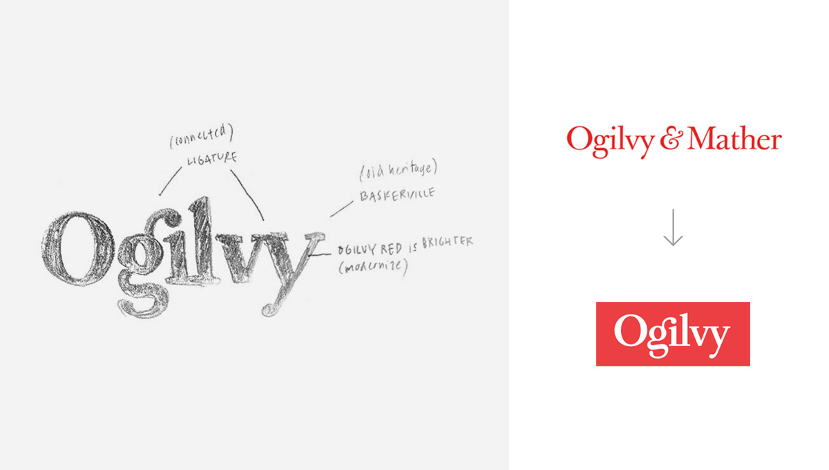
To simplify an already simplified wordmark, Collins (Dropbox, Chobani, Aldo, Spotify) partnered with creative giant Ogilvy to release its re-founding identity. Using a thicker version of Baskerville, the mark is readable both digitally and in analog form. Agility, connected, collaboration and modernization are keywords in this refresh, with a strong callback to a brightened heritage Ogilvy Red.
The identity is almost entirely typographic with little supporting imagery/photography. Brian Collins of Collins said of David Ogilvy, “David was, at heart, a writer...It made sense for a company that values writing and ideas to have an identity based on typography.” (2)
Out of these typographic centred rebrands, this may be the most appropriate usage.
Burberry
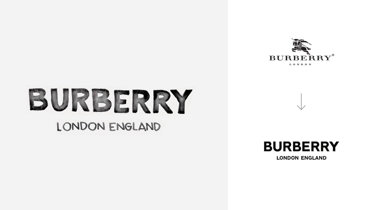
The uniquely British brand Burberry joined forces with designer Peter Saville (Factory Records, Calvin Klein, City of Manchester, Metrolink) to create a workmarked visual identity.
From a traditional serif typography to a modern san serif, Saville dropped the complicated illustration to kickstart its evolution into a digital-friendly logo. (3)
Lest you protest, yes this rebrand can be categorized in the monogram approach too. Not only did Burberry drop it’s classic styling, they also included a motif element in the branding system. See the system in action projected on buildings in Shanghai’s Global Harbor from Burberry’s Instagram.
Monogram
As Burberry just proved, an interesting approach to rebranding also includes monogramming the logo. From Choice Hotels to Major League Baseball, monograms add a level of sophistication and emphasis to a brand.
Comfort
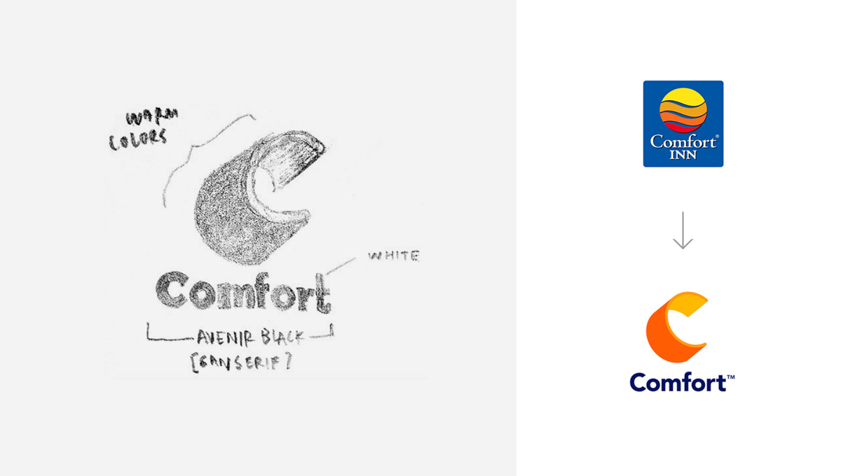
Choice Hotels’ Comfort logo was outdated and clashed on the brighter blue background. The type was previously nice classic typeface, possibly Centaur.
And so, Landor Global (Dixie, World Trade Center, P&G) was called upon created a monogram, affectionately nicknamed "the embrace"; a beacon that maintains the unique inviting colors. (4)
Completing the new identity, a bold san serif modern font of Avenir Black tells the consumer that Comfort Inn is the “Welcome to Goodbye” (5). A warming hospitality brand has transcended it’s old identity to one for a new decade.
EFF
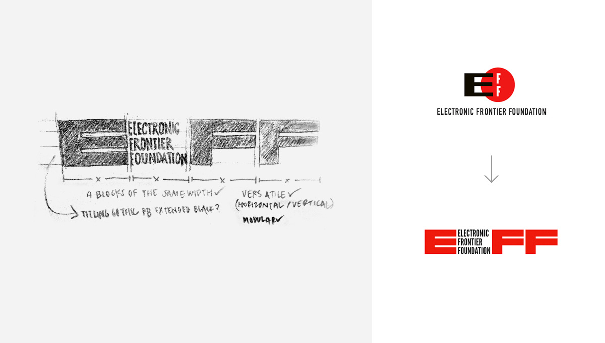
The real brilliance of this mark by Pentagram’s Michael Bierut (The New York Times, Saks Fifth Avenue, MIT Media Lab, Mastercard) is in the flexibility of the monogram (6). The digital privacy defender EFF needed a versatile identity refresh with alternate lockups that act as a canvas for supporting elements. An excellent rebrand, EFF can use these alternates as modular designs.
Miami Marlins
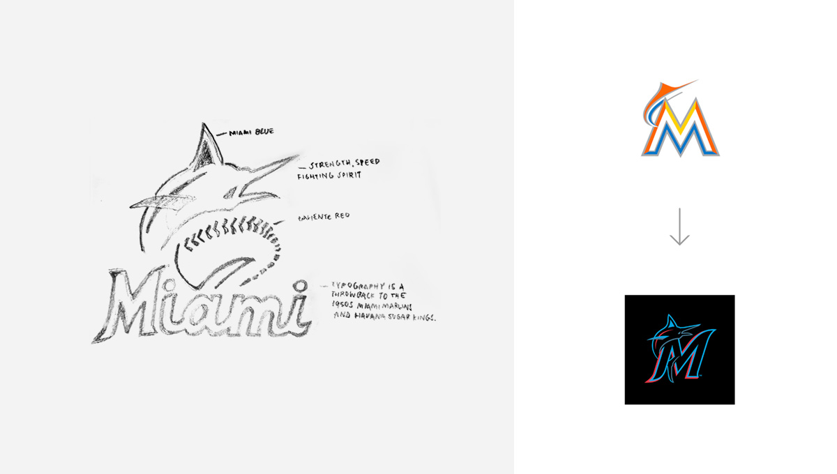
While the Miami Marlins didn’t rebrand from wordmark to monogram, they certainly upgraded their old monogram. Using a knockout technique to pop Cliente Red and Miami Blue on top of Midnight Black and Slate Grey, the Marlins created a wonderful alternate mark the features a jumping marlin.
The palette is taken from the vibrancy of Hispanic culture in South Florida and is quite unique to Major League Baseball. Typography itself in the monogram and primary mark is reminiscent of the 1950 Miami Marlins as well as the Havana Sugar Kings.
Subtle Iconography
Best Buy
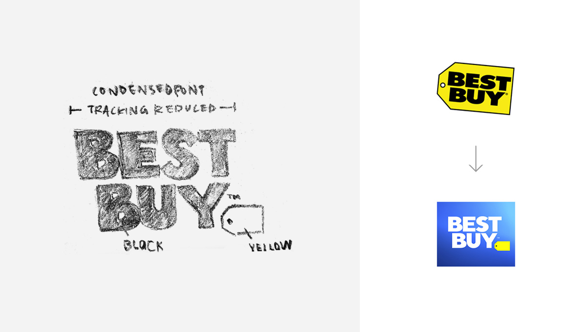
This redesign is part of a new marketing strategy from Best Buy to update colors and highlight the culture and expertise of their Blue Shirt employees. The previous name encircled in a yellow tag wasn’t getting the humanism across.
With less emphasis on the tag, the price is no longer the totality of the story but rather the Blue Shirts' expertise and talent. The story of the Blue Shirts. The employees of Best Buy are the “insurmountable advantage”. (7)
Gradients
Gradients are an easy way to modernize a logo. Updating the color scheme within the gradient can also go along way in a new identity.
Mozilla
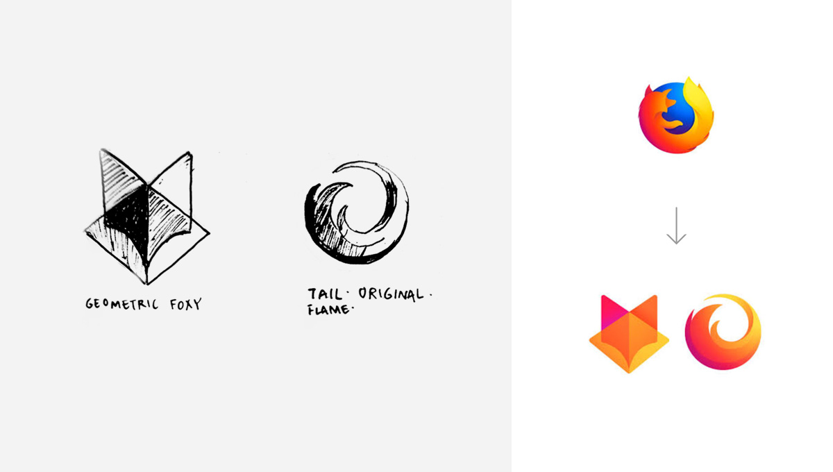
Mozilla, makers of Firefox, is moving away from a flaming-tailed fox surrounding the globe. A new master brand would lead a family of icons to promote its individual products.
Outlined here are the two options for their master brand. One, a stylized fox head. The other, a spiralling flame which us quite reminiscent of the original.
Mozilla is looking to incorporate its customer base into the decision. Clarifying they're not "crowdsourcing the answer" or promoting spec work, Mozilla is simply opening up the conversation to feedback from users who will be utilizing these icons. (8)
Lending Tree
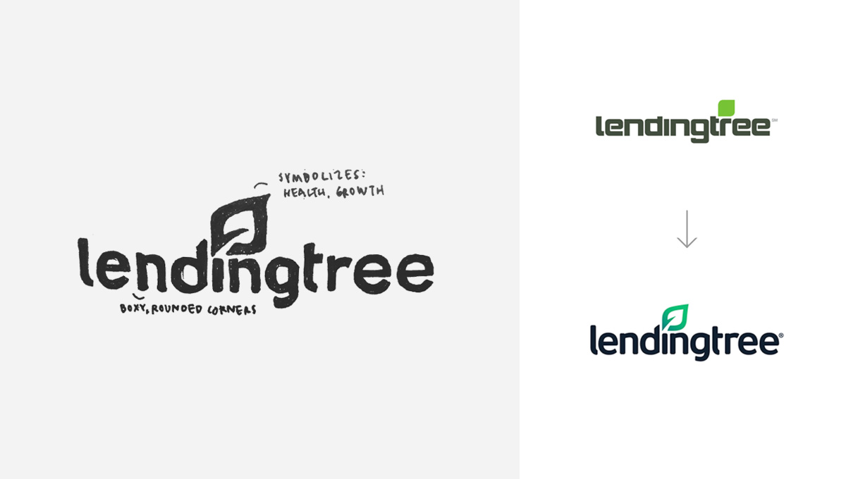
Leading online loan marketplace Lending Tree modified their mark to not only update the font but include an iconized and gradient lead. Led by VP of Brand/Creative Todd Lauer and Sr. Creative Director John Iafrate, Lending Tree’s main identity is the icon leaf which is “open” and shows the "empowering candid culture." It also utilizes the imagery of
- A pen quill
- The strength and perseverance of a flame
The aim of this rebrand was to reintroduce Lending Tree as a diversified product/service company. The refreshed brand identity is essentially successful if it, as Brad Wilson of Lending Tree says, "stands out among competition but finds itself somewhere between an innovative start-up and an established, trusted financial institution". (9)
Lowercasing for Form
Ascenders and descenders are very helpful in forming shapes of a brand name. All-capped wordmarks are being replaced by lower or title case marks in the following examples.
Classpass
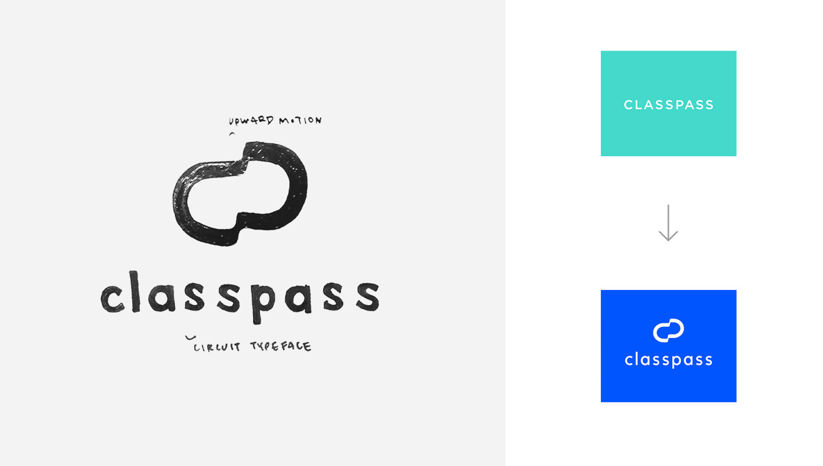
Classpass is a forward-thinking subscription service for studio fitness classes. A new brand identity was created in partnership with Triboro Design. Changing from an all-caps wordmark to a lowercase one in Circuit Bold with a monogrammed icon, Classpass brings mobility, fun, social connection, routine, results-oriented ideas back to fitness. Creative Director Greg Hathaway wrote that the brand 'celebrates the way you push yourself every time you press "book"'. (10)
This monogram at the top shows progress and upward motion.
Uber
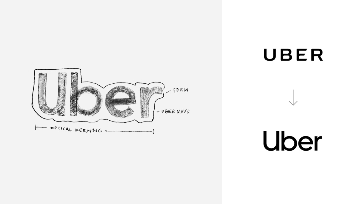
Uber, the original ridesharing platform, rebranded this month by building on established strengths: the color black, name recognition, and the character 'U'. Led by Wolff Olins, a system was designed to refresh and update the company.
A ton of brand elements round out the design but the shape and form is the main focus of this section. A title case “Uber”, set in custom typeface created by MCKL Type called Uber Move is a breakaway from the older all-caps version. Uber Move is a wonderful typeface for UI as well, which is in essence Uber’s bread and butter.
Mailchimp
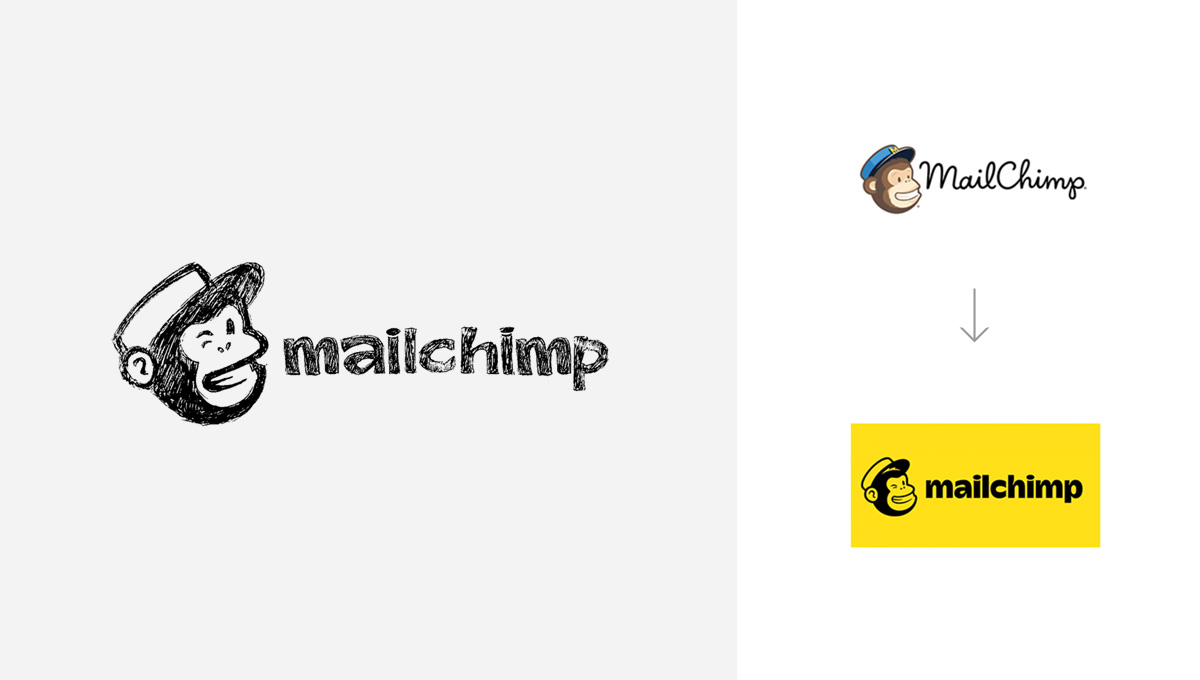
The final lowercased identity mark is Mailchimp. Descriptors like “funky”, “weird”, and “wry” are being lobbed at Mailchimp. It’s humanistic message turns the formally email marketer into a large marketing platform for any sized business.
Mailchimp’s new brand is another Collins masterpiece. Holding on to it’s quirky and unconventional Freddie the Chimpanzee mascot, Mailchimp lost some monkey detail and added a secondary typeface called Cooper Black. Although moving away from the old script, the newer form of this wordmark is quite legible.
Final thoughts
Innumerable branding agencies exist, resulting in as many design approaches. As each brand undergoes a refresh or launch, a strategic approach prior to the rebranding is essential to making sure you get it right this time!
Create your first solid rebranding brief with HolaBrief. Sign up now.
(1) https://news.dunkindonuts.com/news/releases-20180925
(2) https://www.designweek.co.uk/issues/11-17-june-2018/collins-gives-global-ad-agency-ogilvy-streamlined-brand-identity/
(3) https://www.designweek.co.uk/issues/30-july-5-august-2018/burberry-reveals-new-logo-and-monogram-designed-by-peter-saville/
(4) https://www.prnewswire.com/news-releases/comfort-brand-unveils-new-logo-300640950.html
(5) https://www.forbes.com/sites/steveolenski/2018/05/22/this-brand-takes-comfort-in-a-new-logo
(6) https://www.pentagram.com/work/electronic-frontier-foundation/story
(7) https://corporate.bestbuy.com/best-buy-launches-refreshed-branding-logo
(8) https://blog.mozilla.org/opendesign/evolving-the-firefox-brand
(9) https://www.lendingtree.com/press-release/lendingtree-unveils-new-logo-and-brand-identity
(10) https://www.adweek.com/creativity/classpass-ushers-in-a-new-era-with-a-clean-bold-rebrand